
Information Architecture
Chapter 7:
Hybrid Category Page Information Architecture
Introduction
This chapter showcases the culmination of my taxonomy-driven IA work in the form of a hybrid category page for a “Dresses” section. Here, controlled-vocabulary modeling meets real-world UX: a richly layered prototype that blends editorial inspiration (hero imagery, curated call-outs, staff picks) with powerful discovery tools (faceted filters, deep-links, analytics-driven badges, and flexible grid controls).
You’ll see how each module—mapped directly to the underlying taxonomy—guides both casual browsers and power users through a seamless, scalable shopping experience. This chapter also includes a unified content/navigation blueprint, ensuring designers, engineers, and stakeholders share one clear vision for every page component and interaction.
1. Hybrid Dresses Category Page Prototype
Objective
Create a taxonomy-driven, hybrid category page for the “Dresses” section that both inspires undecided shoppers with editorial layers and empowers power users with deep, faceted controls—leveraging controlled vocabularies and analytics-driven badges.
Approach
Taxonomy mapping
Defined two custom taxonomies:
Occasion: Everyday, Summer Holidays, Going Out, Bridal & Events.
Silhouette: Wrap, Maxi, Slip, Modern Shirt.
Hybrid IA layering
Hero module: Full-width banner + “Discover Your Perfect Dress” intro.
Curated strips:
• Shop by Occasion tiles (with click-count badges).
• “View All Dresses” CTA for power users.
• Shop by Silhouette tiles.
• Staff Top Picks editorial carousel.
• Mid-page “Silhouettes 101” call-out block.
Product listing & controls
4-column grid of product cards (carousel arrows, Quick View label, swatches, star ratings).
Search-within, view-toggle (2-Col/4-Col), sort (“Newest”), pagination with “Showing n of Total”.
Faceted sidebar
Ordered by impact (Size → Material → Color → Print → Sleeve Type)
Live counts, “Popular” badges, progressive disclosure (“See more…”), “Clear All Filters”
Dresses Hybrid Category Page Prototype

Annotated Dresses Hybrid Category Page

Key IA & UX Takeaways
Taxonomy → UI
Every tile label and facet name is a 1:1 pull from our controlled vocabularies, ensuring governance consistency.
Hybrid pattern
Balances inspiration (hero + editorial) with efficient discovery (full grid bypass, facets).
Analytics prioritization
Click-count badges and “Popular” chips surface high-demand filters to reduce zero-hit risk.
Scalable facets
Live counts + “See more…” keep the panel usable from dozens up to thousands of SKUs.
2. Content & Navigation Map
Objective
Produce a single “blueprint” artifact that documents every major Dresses category page module, ties each to its taxonomy source and deep-link logic, and visualizes the linear flow—from global nav to pagination—to align designers, IA, and engineers on one shared IA specification.
Approach
Content & Navigation Map table
Identified 11 modules (0–10), described each module’s purpose, its origination in the taxonomy or UX research, and the URL parameters or behavior it drives.
| Section | Purpose | Taxonomy Source | Link & Notes |
|---|---|---|---|
| 0. Global Site Nav | Cross-category jump bar | Top-level taxonomy | Sticky on all pages |
| 0b. Breadcrumb Trail | Orientation & deep-linking | IA hierarchy | Home » Women » Dresses |
| 1. Hero Module | Brand tone + category intro | PrefLabel “Dresses” | Full-width banner + heading + subhead |
| 2. Shop by Occasion | Jump to top-click subcategories | Occasion terms | Tiles deep-link to ?occasion=Everyday etc. |
| 3. View All Dresses CTA | Immediate full-grid bypass | — | Button deep-links to ?view=all |
| 4. Shop by Silhouette | Drill-down by major dress families | Silhouette terms | Tiles deep-link to ?silhouette=Wrap etc. |
| 5. Staff Top Picks | Editorial highlights | Editorial selection | Cards link to product detail pages |
| 6. Editorial Call-out | Styling guidance mid-page | N/A | “Silhouettes 101” guidance block |
| 7. Search-Within & View/Sort | In-grid search + display controls | UI component + analytics | “Search…” input, VIEW: 2-Col/4-Col, SORT: Newest |
| 8. Facet Panel | Faceted filtering | Size, Material, etc. | “Popular” chips, live counts, “See more…” |
| 9. Product Grid | Core listing area | Product metadata | Carousel arrows, Quick View, swatches, ratings |
| 10. Pagination & Count | Reassurance & deep browsing | Total count & state | “Showing 6 of 4,321 Dresses” + Prev/Next |
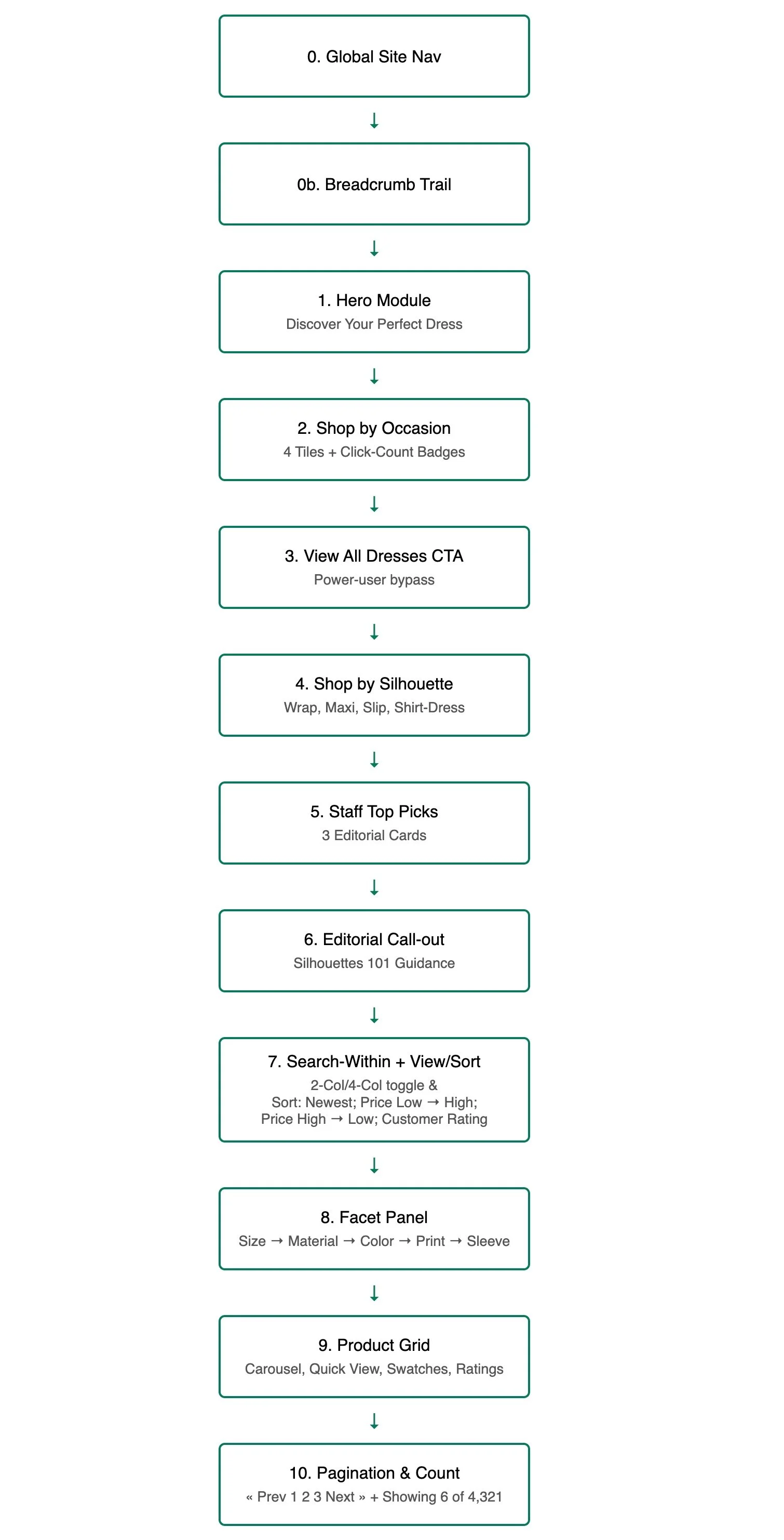
Linear flowchart prototype
Created a mock of nodes, sequenced top-to-bottom, matching the table order.
Styled each node with clear labels and arrow connectors to indicate reading order.
3. Impact
Shared vision
A single spec that everyone—design, content, engineering—can reference.
Faster hand-off
Developers get clear URL parameters, CSS dimensions, and taxonomy mappings upfront, reducing iteration cycles.
IA integrity
Dual artifacts (table + flowchart) ensure no module drifts in implementation; every update must align with both.
4. Summary
By pairing a rich, hybrid prototype with a rigorous content/navigation blueprint, I demonstrate how controlled vocabulary IA scales from mockups to production—delivering a category page that educates, inspires, and equips every shopper to find their perfect dress.
Up Next: Chapter 8 – Continuous Information Architecture Governance Loop